Maps — A Matter of Point(s) of View
Abstract
Some time ago, HarperCollins published an atlas — to be distributed in the Middle-east — with no Israel on it. While the specific issue generated news galore, it made me think of writing a rather generic document on the topic of «maps as a point of view» more than a factual representation of the world… The world as we would like it to be?.
I have always been passionate about maps — both real and fantastic — and through my personal studies of them, I realised that with the exclusion of road and navigation maps, no map is really… real. All maps are used to ① make a point or ② to express (sometimes, impose) a point of view.
While road and navigation maps need to be correct — unless you want to be purposely and maliciously deceitful — all other maps do not really need to be correct. A map depicting the whole world is more likely to be used for educational purposes — and forgotten almost immediately afterwards — by students to learn the location of continents, states, important cities, tall mountains and long rivers. If a map does not really need to be accurate, it can actually represent an idealistic, or personal, view of the world or — I hate the term but in this context it has to be intended with the widest possible meaning — politicised version of it. The interesting fact is that this has always been the case. Since the times in which it would have been already possible to make realistic maps, geography has been abused and stretched by kings, queens, religious authorities and simple men to serve their agendas and needs.
After all, a map is a matter of trust between the person who draws it and the other person who reads it. Is Italy really boot-shaped? According to maps yes but can you verify? Sure you can. You can compare multiple maps, circumnavigate it or fly to space and take a look. Usually the only thing that you can do is comparing multiple map and trusting all them. That's probably the reason why maps have been used for educating people to a particular view of the world.
One of the pivotal points in this discussion is the problem of where to centre your map. The world, by its own nature, is — almost — spherical. Being spherical is kind of a nice shape for a planet with a population: you can turn and rotate it in all directions and it always looks the same. It is fair. On the other hand, a map, as the result of the projection of the sphere on a flat surface, has the bad habit of having a top and a bottom, and a left and a right. That wouldn't be a problem except for the fact that we have assigned to those terms a human, moral, qualitative meaning. As you can now realise yourself, the problem of who — and not really what — is placed at the centre of the map is a very important issue.
We could be tempted to believe that, in ancient times, nations loved to place themselves in the centre of the maps because they used to expand in multiple directions and what was not conquered was unknown. This is false. At the times of ancient Greeks and Romans, the existence of India was well known as Alexander the Great expansion war stopped at the river Ganges. For the Arab merchants, the stretch of sea from now Somalia to China had very little unknowns as they travelled it to do business with both the Empire of China and the kingdoms of east Africa. Phoenicians settled colonies on the Canary Islands. The idea that the ancient world was a place plagued with ignorance, ignoring the real complexity of the world, is actually an idea that has been carried on during romanticism in the 1800s. Just to give an even stronger evidence of this, the fact that the world was somehow spherical was known — at least by acculturated people — in the ancient Greece: Pythagoras was reported to refer to Earth as a sphere back in the 6th century BCE. Eratosthenes not only knew that the world was not flat but he even approximately measured its radius with an error of just 2% (39375 km vs. 40041 km). Around the same time, by observing and gathering reports of the differences in the tides on the western and eastern coasts of Africa, Hipparchus had the intuition that a continent — lately known as the Americas — was laying in between Europe and Asia, going west.
Now, let's get back on track and let's start looking at some maps.
The very first set of maps is about the vision of the world that was considered useful in the Middle Ages and, in particular, in the western and Christian world. They all have the same characteristic: Jerusalem is placed at the very centre of the map and the rest world, evenly, radiates from that point. Here they are in all their beauty:


The first map is the Psalter map and it was produced around 1260. The second one is the Bünting map and it was made in 1581 — which, to be correct, is 89 years after the formal end of the Middle Ages. I have to admit that the second map required quite a bit of fantasy to be drawn because, while Jerusalem is still placed in the very centre of it, Asia, Africa and Europe are depicted as the petals of a flower. America is there, on a corner, just for completeness but since it was not part of the Bible, it did not deserve a petal. I always found that map very fascinating and beautiful.
Just to give you a meter or comparison, the following map — a naval one — was made at the end of the 1200s, i.e., less than 30 years after the Psalter map and more than 350 years before the Bünting. As you can notice, when a map is needed for something practical it is extremely accurate — in this case at least the Mediterranean part is accurate enough. This map is known as the Carta Pisana because it has been found in Pisa, although it could have been produced in Genoa or Venice as well and it is the oldest known navigational map. The fist picture depicts the map itself; the second one is a modern rendition that makes possible to see the lines clearly.
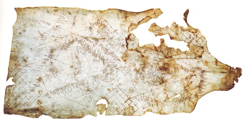

One very interesting thing to notice is that contrary to what movies about pirates and old times navigators have shown us for ages, the map does not have monsters drawn on it 😊
The habit of centring the map on some point of personal, political or moral interest has been going on for a while, and it still does. Looking at the map below, you can observe a quite "familiar" notion of eastern and western worlds. Europe is in the middle, Asia is "east" and the Americas are "west":

That view of the world, as you can expect, has deep roots in the colonial era when European countries used to have colonies around the world and they loved, and needed, to be the centre of the — civilised — world.
What about this other possible view of the world? While many people of the Americas would love it, such a map would redefine in the observer what the "eastern" and "western" worlds are:

Russians would not be happy as they would found themselves split on the left and right sides losing a bit of graphical and perceived importance 😊
Let's change the centre of the map again — I love this game 😊 — and let's put the focus on the Pacific area totally inverting the ideas of "western" and "eastern" worlds!

Up to now, we played with centring the map differently on the east-west axis. What about starting to play on the north/south dichotomy?
We are trained, by the media, our families, etc. on having a "bad" idea in our minds when hearing of the "south of the world". We tend to associate that with developing countries, the third world, famine, and banana republics. Personally, I always associated the southern hemisphere with music, colours, and being able to enjoy the small things of life — and this last one, for me, is a major thing. It is not by chance that it is depicted on the lower part of the map. After all, the fact that the north should be on the top part of the map is arbitrary. Let's look at the following map and if you think that it is "upside-down", you are not a bad person. That just means that whoever seeded in your mind the idea that the "civilised" world should be on top made an incredibly successful job:

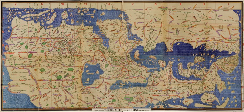
While the map above could look original — subversive, even — that has been exactly the way that Arabic people used to depict the world in their maps back in the Middle Ages. The following map is known as the Tabula Rogeriana (or Nuzhat al-mushtāq fi'khtirāq al-āfāq — نزهة المشتاق في اختراق الآفاق) and it dates back to the 1154 (but the work to produce it was started in 1138!) and depicts the world, from Spain to China, and from north Europe to some point in Africa (which is brutally cut):
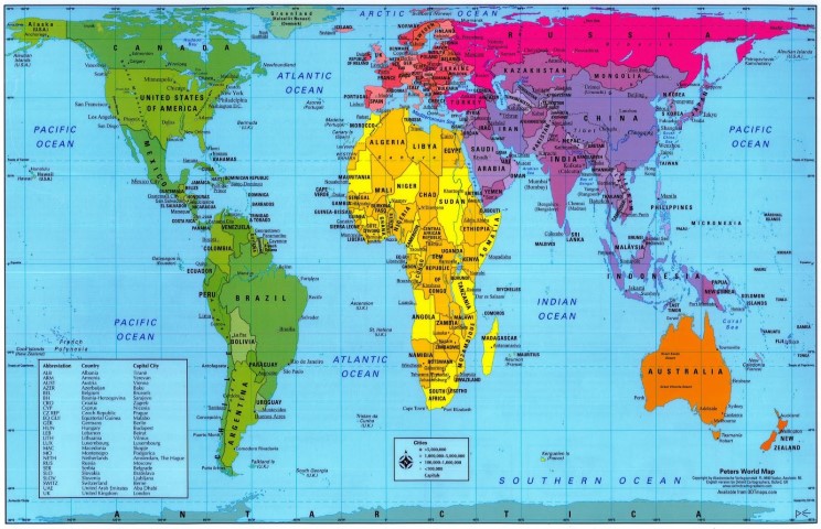
One thing that I didn't mention yet is that not only the maps are usually centred on Europe on the east-west axis but world maps are centred a bit on the northern side as well. To be honest, the majority of the emerged lands are on the northern hemisphere and having a better vision of those could be practical. Nevertheless, this way of looking at the world confused many people on the real size of continents and nations. Even Bush, the ex-president George Bush Jr., was amazed by discovering that Brazil is big!
Thanks goodness, James Gall (and later Arno Peters) in 1855 (and 1973) decided to find a better projection of the world and come up with the following map which, first, depicted the size of countries and continents as they deserve. You can appreciate, probably for the first time, the fact that Greenland is not as ginormous as you always thought:
That's it for today's adventure in the world of the maps. We have looked at some maps, pointed out some interesting peculiarities and — I genuinely hope — learnt something 😊
Why did I write this?
Let's start saying that I am a nerd and among my nerdy passions — which include anthropology, comparative mythology, cooking, spirits, and history — the one for maps always had a special place in my heart. Maps, especially the old ones, are fascinating, beautiful pieces of art that show the curiosity of men and their natural predisposition for exploring and knowing, lifting the curtains of ignorance and make it possible for other people to learn and thus, progress.
Another reason why I love maps is because they tell you way more about the culture that draw them than about the geography of the world or of a particular place.
Thanks
I would like to thanks Stefano Basagni and Serena Cameirano for all the precious reviews, comments and feedbacks during the writing of this document. Thanks guys, you rock! 😊


