Pie Charts Suck B*lls
Abstract
I am a data scientist, relevance engineer or, if you prefer, just a guy playing with some data and machine learning for a living. I love data, I love finding patterns in that and writing software for doing that. I worked with massive datasets in my life: multi-petabyte scale stuff stored on thousands of nodes which take thousands of cores to analyse in a parallel environment, like Cosmos. If there is one thing that I learnt is that all the knowledge that you can extract must be summarized in few pieces of information to be useful to humans. Sometimes, the best way to serve this summarized data to humans is through a graphical depiction of that or, as it is usually called, a chart.
In my life I have seen, and produced, some good charts and some bad ones. I have seen some beautiful charts really able to make a point and summarize the data in an effective way and I have seen horrible depictions of data. In this last category, the most ignoble chart that human mind could have ever produced is — by far — the pie chart.
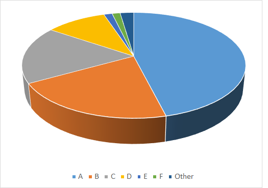
Pie charts are the most useless piece of sh*it that you can find in a slides deck or in a document. Don't you trust me? Let me give you an example. Let's consider this data:

This data has been anonymized — as for this example we do not care — but it represents some real usage of products by some users. It does not take a genius to understand that A is the most used product among the ones in the chart. Question: which product is second? B or C?
The pie chart does not help very much in understanding this but we can always help ourselves putting the values in the chart:

How wonderful, we totally lost the primary reason for making a chart in the very first place: making things easy and quick to understand the data without the need of reading the values!
Do you know how you can make things worse? With a 3D pie chart!
The right question, now, could be: what would have been the best chart for the job?
The response is: the simplest one
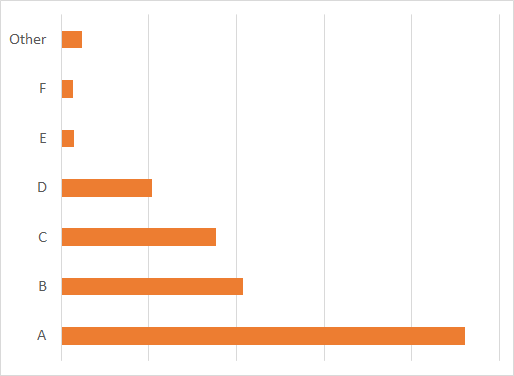
A simple, easy-peasy, bar chart. Even without any number, you immediately get which product is first, second, etc. you also immediately get that the "other" slice is actually larger than E and F.
PS: If you like pie charts, you suck more than they do


